Wardrobe Spreadsheet Analysis: Getting Started

In this post, we're going to explore how you can find out information about your wardrobe using Google Sheets/Excel calculations and analysis tools.
I'm going to assume that you're unfamiliar with doing analysis in spreadsheets, so we'll start from the beginning with these. I'm also going to assume you're working with this template here, and have maybe read that post, but you can also adapt these techniques to your own spreadsheet. The "mood" of this post is exploring a method of analysis, maybe in a bit of a stream of consciousness way. This is an easy introduction, plus I hope it will help you feel comfortable exploring on your own, rather just giving the "answers" for things. This is a first step into getting familiar with using these tools in the context of an egl wardrobe, in future posts we will go over specific calculations, formulas, and functions (I'm getting into the rabbit hole of custom functions now...)
I'm going to focus on main pieces because I haven't gotten around to entering complete data for any other part of my wardrobe (oops). Hopefully yall like pictures, because this is going to be full of step-by-step pictures. Click on them to get a better look at them!
***
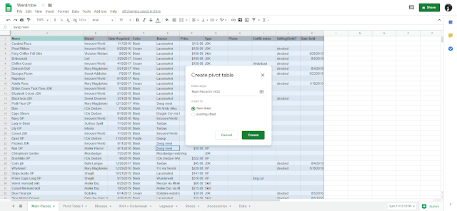
Ok, so this view of the Main Pieces tab here is just raw data. You can see it, and start to draw some conclusions from it, but nothing substantial.

The tool we're going to focus on here is the pivot table. I promise they're not scary, and they're super useful.
Here's how to make one:
Here we have a blank pivot table. Sheets has already started trying to process my data by anticipating what I might want to know, in the pivot table editor on the right. They're not...exactly what I want to do with the data, but it's a good starting point!
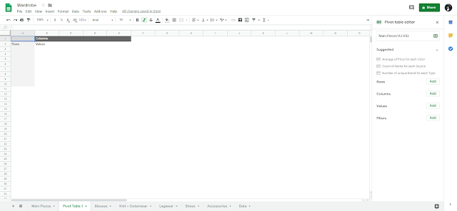
Just to get a feel for how to use a pivot table, let's click on the "Average price per color" suggestion. I learn better by taking something apart, maybe you do too!
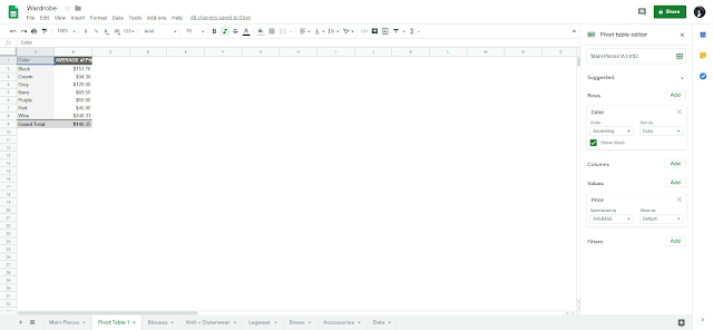
This doesn't really mean anything, but we can see how the table works! If we look at the editor pane on the right side, we can see that it groups the main pieces by color, and calculates what the average price is for each of those colors. Let's start with this and modify it.
- Data->pivot table
- It will ask you to select a data range, ctl+a (cmd + a on Mac) to select everything in the Main Pieces tab
- Sheets knows that the top row is a header row, so it knows to ignore it
- Put the table in a new sheet

Here we have a blank pivot table. Sheets has already started trying to process my data by anticipating what I might want to know, in the pivot table editor on the right. They're not...exactly what I want to do with the data, but it's a good starting point!

Just to get a feel for how to use a pivot table, let's click on the "Average price per color" suggestion. I learn better by taking something apart, maybe you do too!

This doesn't really mean anything, but we can see how the table works! If we look at the editor pane on the right side, we can see that it groups the main pieces by color, and calculates what the average price is for each of those colors. Let's start with this and modify it.
First modification: filtering for only things I currently own
- Filters->add
- Click Selling/Sold
- Uncheck "checked"
- I imported my data from Airtable so this is how it represents a checkbox from there. Maybe I'll fix it one day, and change it to something like "x" or "sold". The important thing is consistency.
- Click OK, now the filter is applied and we only see data for things that are in my wardrobe now

Let's change the Color row to Brand, so we can see what the average price is per brand
- Rows->add
- Select "Brand"
- Delete the "Colors" row

This is pretty ok! We get to see what the average price I've paid for pieces of each brand in my wardrobe. My first thought when seeing this was to start thinking why these numbers are what they are. Well, maybe it's because some things are secondhand and some things are new? Let's add an additional row. Add a row for "Source", and we can dig a little more.

I think my guess is correct. Take a look at the breakdown of Atelier Boz by source. One piece I got from Mercari for $60, and another I got from them brand new for much more.
Seeing the average is ok, but when I see things broken down by source, I want to see sum totals so I can see how much I've spent. Click on the "AVERAGE" dropdown in the "Price" Value box. Here is a load of things we can calculate.

Google Sheets has pretty good documentation and guides, there is a good guide to what these functions do here.
I think we've gotten reasonably comfortable using doing some analysis! We made a pivot table, and started with a suggestion and modified it. We added a filter to only show items that I currently own, and manipulated rows, columns, and values to answer questions. Next time: asking definitive questions of the data and answering them!


Comments
Post a Comment